How to Level Up Your Visual Branding on Instagram
.jpg)

Creating strong visual branding on Instagram begins with understanding how your images, colors, and design choices influence the way people feel when they see your profile. When you build each piece with calm intention, your presence becomes clearer and more inviting. This helps your audience understand your message without confusion or pressure.
Improving your visual branding also helps you communicate with more confidence. When your feed feels balanced and consistent, people immediately understand who you are and what you offer. This gentle sense of clarity supports deeper connection, smoother growth, and a more enjoyable creative experience as you build your identity over time.
Understand Your Brand Identity
Understanding your brand identity gives you a strong base for everything you create. When you know the feeling you want your audience to experience, your choices become more natural. This sense of direction makes it easier to design posts, stories, and videos that feel calm, intentional, and unique to your presence on the platform.
A clear identity also helps you stay consistent as your account grows. When you understand your purpose, your style choices become simpler and more intuitive. This makes it easier to shape a recognizable look that stays true to your values while remaining flexible enough to evolve gently over time.
Define Your Style
Defining your style helps you share a steady and recognizable look across all your posts. When your visual elements match your tone and message, your audience feels a stronger connection. This sense of unity supports Instagram branding by guiding every creative decision with gentle clarity and purpose. This approach aligns well with Instagram caption spacing, as your text and images work together to create a smooth and pleasant viewing experience.
A defined style also helps you avoid guesswork. When you understand the feeling you want to express, choosing images becomes easier and more enjoyable. Exploring different types of aesthetics can guide you toward visual choices that match your personality and help your content develop a steady and recognizable rhythm.
Simple Visual System
A simple visual system makes your content easier to create and easier to recognize. When you keep your design choices clean and organized, your feed feels more inviting. This steady structure supports Brand identity because it allows your visuals to communicate who you are with calm and clear intention. This idea also fits naturally with vanish mode on Instagram because even short-lived moments feel consistent with your overall identity.
Using a simple system also reduces creative stress. When your design choices follow clear guidelines, your workflow becomes easier and more intentional. This kind of steady routine protects your identity from confusion that often appears when accounts rely on Instagram bots or unpredictable automated tools.
{{blog-cta-section}}
Colors
Choosing a consistent color palette helps your audience recognize your posts instantly. When your colors match your message, the entire feed feels calmer and more meaningful. This sense of unity supports Instagram brand guidelines by creating visual harmony that blends with your identity and emotional tone. This attention to color works well with Instagram report reflections, which often highlight emotional reactions to visual content.
Colors also help shape the mood of your content. When your palette feels warm or cool, bold or gentle, it guides how people experience your work. This emotional connection strengthens your message and helps your visuals feel more complete across each post.
Fonts
Fonts can shape your visual identity as much as imagery. When you choose simple and readable styles, your audience understands your message without distraction. This supports visual brand identity by keeping your text calm, clear, and aligned with the feeling you want to express in every design. This thoughtful choice also connects naturally with strategies for business, as clear communication is essential for expressing your brand’s personality across every post.
Consistent fonts also support brand memory. When people see the same style across multiple posts, they learn to recognize your voice. This familiarity builds trust and helps your visual work feel organized, intentional, and comfortable for your viewers to follow.
Layout Rules
Layout rules guide the structure of your designs. When your spacing, placement, and composition follow a gentle pattern, your feed feels more balanced. This organized look supports Instagram brand guide creation and helps you maintain visual order even as your content grows over time. This calm approach reflects the type of clarity people often notice when exploring the most followed on Instagram accounts, where every post feels intentional and thoughtfully arranged.
Having layout rules also helps you avoid distractions that weaken your visual identity. When your spacing and structure follow a steady pattern, your posts feel clearer and more intentional. This awareness also reminds you to avoid banned hashtags, which can disrupt visibility and harm the calm rhythm of your overall presentation.
Upgrade Your Instagram Feed
Upgrading your Instagram feed begins with understanding how every post contributes to the overall mood you want to create. When your feed feels visually connected, people experience a gentle sense of comfort while scrolling, which makes your identity clearer and more familiar over time.
A thoughtful feed also helps your audience trust your presence. When images, colors, and layouts match your message, your content feels more genuine. This calm consistency supports deeper engagement and encourages people to return because they feel connected to your style.
Choose a Consistent Theme
Choosing a consistent theme helps your content feel unified and peaceful. When your posts share similar tones or ideas, your audience notices a clear pattern. This kind of harmony strengthens Instagram feed ideas because it gives your visual story a steady emotional flow.
A theme also helps guide your creative decisions. When you know the feeling you want to express, selecting photos, colors, and layouts becomes easier. This gentle structure supports long-term clarity and helps you build a recognizable presence with less stress. A clearer sense of structure aligns with visual consistency, which strengthens how a style holds together across an entire feed.
Grids and Layout Patterns
Grids and layout patterns give your feed structure. When your posts follow a simple visual order, your content appears more intentional and easier to enjoy. This style supports Instagram branding by helping people recognize your approach through gentle and predictable visual organization.
Using patterns also reduces creative overwhelm. When you know how your next posts will fit together, planning becomes calm and steady. This sense of direction supports your identity and keeps your feed comfortable to view.
Create Scroll Stopping Posts

Scroll-stopping posts capture attention through thoughtful design. When you combine clear imagery with gentle colors and simple text, your audience pauses to appreciate the moment. This intention supports Instagram feed design by creating visual moments that feel memorable and unique.
These posts also help your message stand out in a busy space. When your designs feel warm and inviting, people stay longer, explore your content, and connect with your identity. This deeper attention strengthens your presence and encourages natural growth. Attention-grabbing visuals are often shaped by design principles, which outline how certain elements naturally draw the eye.
Improve Reels Branding
Improving your Reels branding helps your short videos feel more polished and recognizable. When your style stays steady across clips, viewers learn to associate your visual choices with your identity. This gentle consistency creates a smoother viewing experience and supports long-term recognition.
Reels also give you a chance to express your personality. When your visuals match your message, your storytelling feels more heartfelt. This approach brings emotional connection and helps people remember your content with warmth and curiosity.
Intro Outro Style
A clear intro and outro style helps your Reels feel complete. When you open and close your videos with gentle consistency, viewers understand your rhythm. This habit supports Instagram feed ideas for business by giving your content a structured and trustworthy flow.
Consistent intros and outros also help reinforce memory. When viewers hear the same tone or see the same visual cues, your identity becomes easier to recall. This creates a calm and grounded viewing experience.
Reels Text and Color Guidelines
Reels text and color guidelines help maintain harmony between your short videos and your overall feed. When your text colors match your palette, your content feels more coherent. This gentle unity strengthens the best Instagram feed development by tying everything together with soft visual balance.
Consistent guidelines also improve clarity. When your text remains readable and clean, viewers connect with your message more naturally. This simple approach helps your audience focus on what matters without distraction.
On-brand Effects
On-brand effects help your Reels feel distinctive. When you use gentle transitions, calm movement, or subtle filters that match your identity, your videos feel more recognizable. This practice nurtures Instagram feed inspiration by keeping your clips visually connected to your overall style. A good visual signature aligns well with creative styling, which explores how consistent artistic choices shape recognizable expression.
These effects also support emotional connection. When your transitions feel smooth and thoughtful, viewers respond with curiosity and comfort. This consistency encourages people to explore more of your content.
Safe Trend Adaptation
Adapting trends safely helps you stay relevant without losing your identity. When you blend current ideas with your own tone, your videos feel fresh while remaining authentic. This supports how to build a brand on Instagram by keeping your content modern but still grounded in your identity.
Trends can be helpful when used with care. When you adapt them in a gentle way, you stay true to your message. This creates a balanced presence that feels both contemporary and personal.
{{blog-cta-section}}
Make Your Brand Recognizable
Making your brand recognizable begins with visual clarity. When your posts feel connected through color, tone, and style, your audience learns to identify your presence instantly. This gentle familiarity strengthens trust and helps people feel more at ease when exploring your content.
Recognition also grows from emotional consistency. When the mood of your visuals reflects your message, your audience experiences a smoother connection. Over time, this creates a peaceful sense of identity, making it easier for people to remember your work and understand your value.
Visual Touchpoints
Visual touchpoints guide your audience through your content. These elements might include colors, patterns, or simple design choices that appear across your posts. When used consistently, they strengthen personal branding on Instagram by giving your viewers small, familiar cues to recognize your presence. Such recurring elements connect with design identity, which explains how visual markers reinforce brand recognition.
These touchpoints also shape your emotional tone. When repeated gently, they create a calm rhythm that brings comfort to your audience. Over time, they help your identity feel warm, steady, and easy to remember across every piece of content you create.
Image Style
A consistent image style helps your audience understand your visual voice. When your photos share a similar mood or tone, people experience your content with more comfort. This steady approach supports Instagram feed design by giving your posts a soft and recognizable character.
Image style also influences how people trust your presence. When your visuals feel calm and sincere, your audience sees your identity more clearly. This helps you build real connections and avoid the uncertainty that often arises when profiles appear inflated by fake followers rather than genuine interest.
Editing Tone
Your editing tone shapes the feeling of your content. When you edit with gentle colors or soft lighting, your feed gains a peaceful and welcoming atmosphere. This steady look supports Instagram feed ideas and helps your posts feel like they belong together.
Consistent editing also simplifies your creative process. When you have a clear approach, editing becomes faster and more enjoyable. This gentle routine helps you produce visuals that match your identity without effort or confusion.
Brand Symbols
Brand symbols can be subtle marks that help people recognize your content quickly. These may include small icons or signature shapes that appear across your visuals. When used with care, they support Instagram feed inspiration by helping viewers connect familiar details with your brand.
Symbols also build emotional memory. When audiences notice these repeated elements, they associate them with your identity. Over time, this creates a gentle and lasting impression that strengthens long-term recognition.
Show Personality
Showing personality helps your brand feel real and approachable. When your visuals reflect your character, people feel more connected, and your identity becomes warmer. This supports how to build a brand on Instagram because authenticity is one of the strongest ways to create trust.
Personality also brings depth to your content. When you share honest moments and genuine reactions, your audience feels more connected to you. Many micro and nano influencers grow their presence this way because viewers respond warmly to creators who express their identity with sincerity and natural emotion.
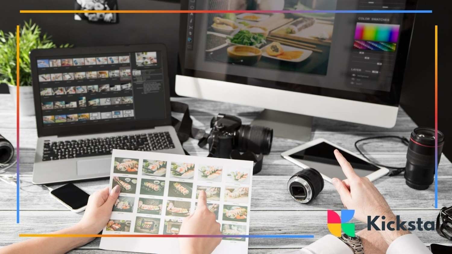
Use Tools to Stay Consistent
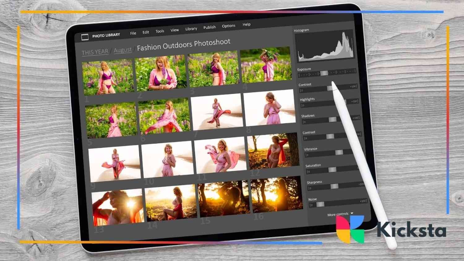
Using the right tools helps your visual branding stay steady and organized. When you rely on simple systems, your workflow becomes easier and more peaceful. This consistency helps your content feel balanced and supports a calm, creative process that remains dependable each day.
Tools also help you save time. When your templates, previews, and planning methods stay aligned with your identity, designing content becomes less stressful. This gentle structure supports your long-term growth and helps your feed remain unified and recognizable.
Templates for Faster Design
Templates help you design with ease. When you use layouts that reflect your identity, you reduce creative overwhelm and gain clarity. This gentle support strengthens Instagram branding by ensuring your visuals remain consistent, and tools like Kicksta can complement this by helping your account grow through natural engagement.
Templates also help you stay flexible. When you want to adjust colors or images, your overall structure remains steady. This balance helps your feed stay fresh while still matching your core identity, and pairing templates with a safe growth tool like Kicksta keeps your presence stable.
Scheduling and Preview Tools
Scheduling and preview tools help you see how your posts will look before publishing. This planning creates a calm sense of control and supports Instagram brand guidelines by helping you design a balanced visual flow that stays true to your identity. When you pair these tools with Instagram analytics tools, you gain a clearer picture of how your content performs. Soft tools like Kicksta can also help maintain steady visibility through natural audience exposure.
These tools also support steady posting habits. When you schedule in advance, you avoid rushed decisions and maintain a gentle rhythm. This protects your brand consistency and helps your feed feel thoughtful and organized, while tools like Kicksta support slow and safe growth.
{{blog-cta-section}}
Feed Planners
Feed planners help you shape your layout with clarity. When you arrange future posts visually, you see what fits and what needs adjustment. This method supports visual brand identity by helping you maintain a peaceful and cohesive look across your grid.
Feed planners also reduce design stress. When you can experiment safely before posting, your decisions become more confident. This freedom helps you create visuals that match your tone without losing the gentle structure you rely on. Planning tools like these are often connected to content mapping, which shows how organized layouts support clearer creative decisions.
Brand Kits
Brand kits keep your colors, fonts, and graphics in one place. When everything stays organized, your creative process feels simple and unified. This system supports Instagram brand guide development by helping you maintain steady visual habits that match your message.
Brand kits also protect your identity as you grow. When your elements stay consistent, your visuals become more memorable. This gentle stability supports long-term recognition and helps your audience feel more connected to your work.
Brand Your Captions and Messaging
Branding your captions and messaging supports the emotional side of your presence. When your tone feels warm and consistent, people understand your personality more clearly. This harmony between visuals and words strengthens your identity and keeps your content welcoming and familiar to your audience.
Clear messaging also deepens the connection. When your writing matches the feeling of your images, your posts become more meaningful. This gentle unity encourages people to engage with your content, helping your brand feel steady and sincere across your entire feed.
Tone and Formatting Rules
Tone and formatting rules help guide your voice. When your captions follow a steady style, your personality becomes recognizable. This support nurtures Instagram feed ideas for business by giving your audience a consistent emotional experience each time they read your posts.
Formatting rules also help your writing feel comfortable to read. Simple structure, gentle spacing, and clear expression make your message easier to follow. This helps your followers understand your story without confusion, hesitation, or distraction.
Pairing Text Style With Visuals
Pairing your text style with your visuals creates a stronger sense of harmony. When your captions match the mood of your photos, everything feels connected. This gentle alignment supports Instagram feed inspiration by helping your audience feel the emotional thread running through your posts. This sense of alignment relates to typographic harmony, which shows how text style and visuals work together to create cohesive expression.
Matching text and visuals also helps set clearer expectations. When your tone reflects your visuals, your audience understands your identity more easily. This consistency builds trust and helps your posts feel balanced and meaningful.
Keep Your Branding Fresh in 2026
Keeping your branding fresh in 2026 helps your presence stay relevant while still feeling true to your identity. When you update your visuals gently, your audience feels both comfort and curiosity. This balance keeps your content alive without losing the calm consistency you have built over time.
A fresh approach also encourages creative growth. When you allow your style to evolve in soft steps, new ideas appear naturally. This steady rhythm helps your feed remain inspiring while still holding the familiar feeling your audience trusts and enjoys.
Evolving Trends to Watch
Evolving trends offer new ways to communicate visually. When you explore updated colors, layouts, or styles, your content gains gentle energy. This openness supports Instagram feed design by helping your posts feel both modern and emotionally grounded without overwhelming your original identity.
Watching trends also helps you understand what your audience enjoys. When you adapt thoughtfully, your visuals feel refreshed while remaining clear and intentional. This smooth evolution keeps your brand flexible and ready for new creative moments. Shifts like these are often discussed in design trends, which highlight how visual styles change over time.
Avoid Losing Identity
Avoiding the loss of identity becomes easier when you remember the message behind your visuals. When you place meaning at the center, your creative choices stay grounded. This approach protects Instagram feed inspiration by keeping your style warm, steady, and true even as trends shift.
Maintaining your identity also builds trust. When your audience recognizes your tone in every post, they feel a stronger connection. This gentle stability supports long-term growth and helps your brand remain memorable across changing seasons.
Key Takeaways
Your visual identity grows stronger through consistency, clarity, and gentle creativity. When you combine thoughtful design with steady emotional expression, your content feels more meaningful. This balanced approach supports healthier engagement and encourages your audience to connect with your work in deeper and more natural ways.
You also build trust when your visuals stay aligned with your message. When your style feels reliable yet flexible enough to evolve, your brand remains welcoming and clear. These small choices create a peaceful experience for your viewers and support long-term growth on Instagram.